Shanghai American School
School Rebrand and Identity Strategy
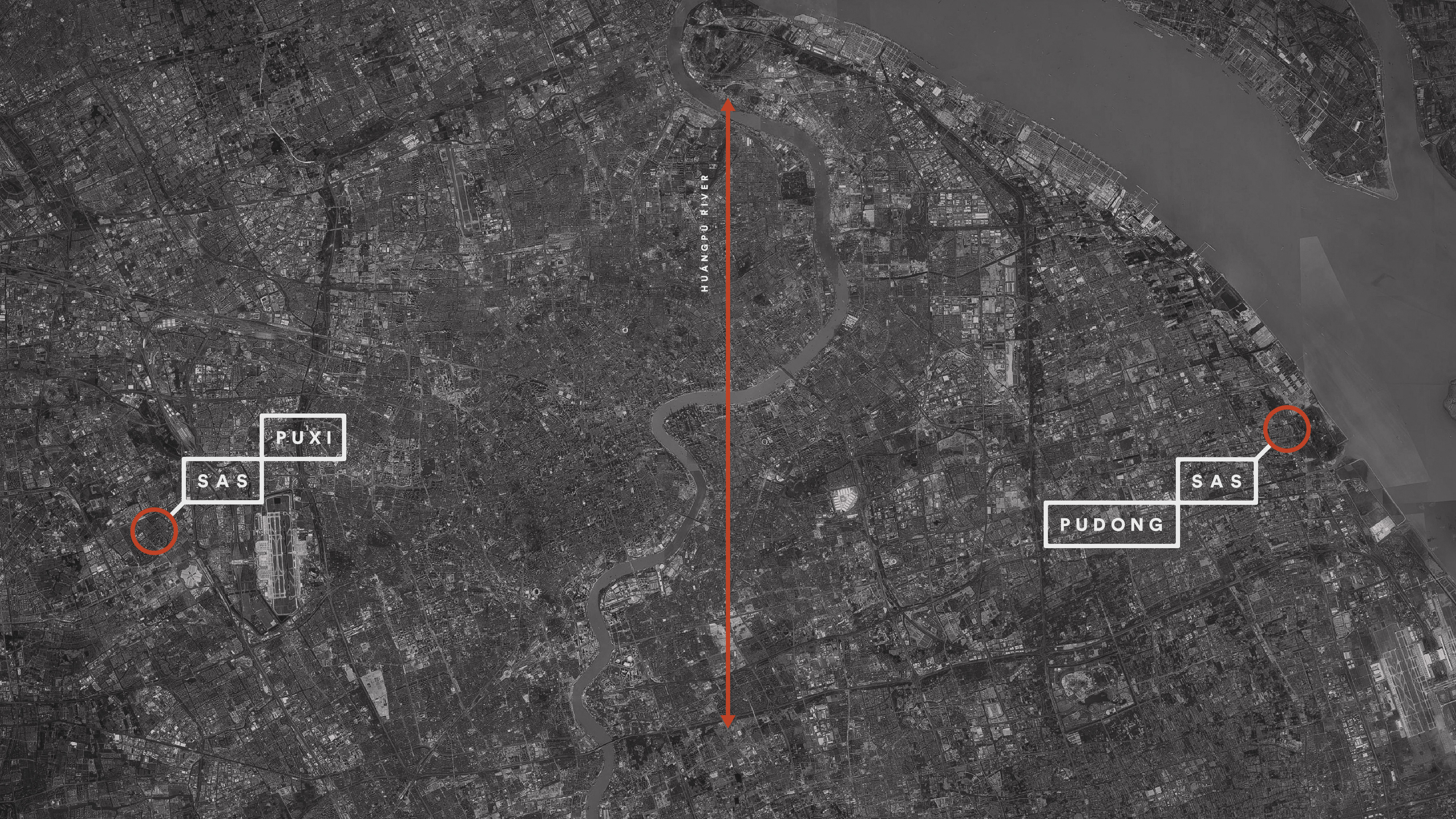
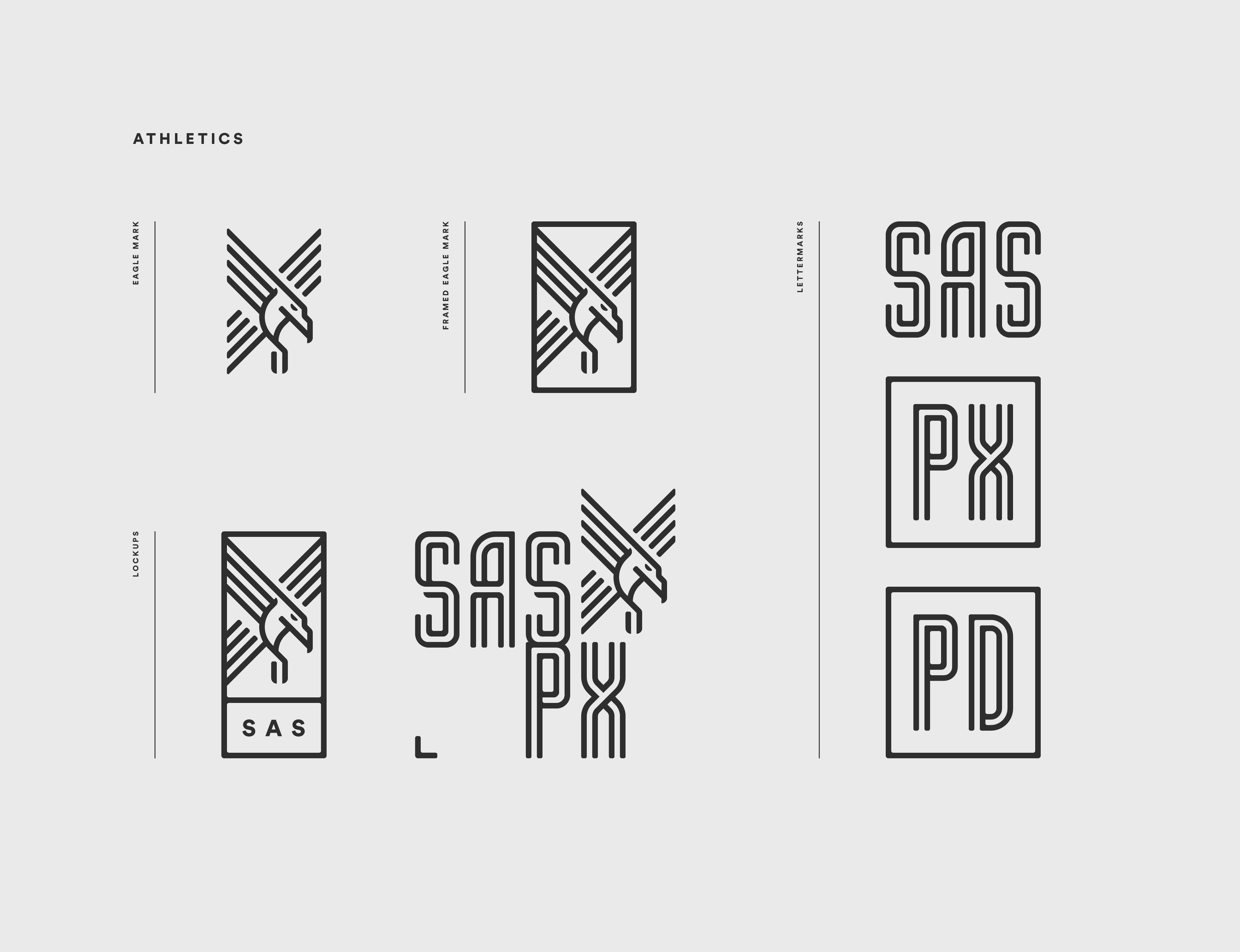
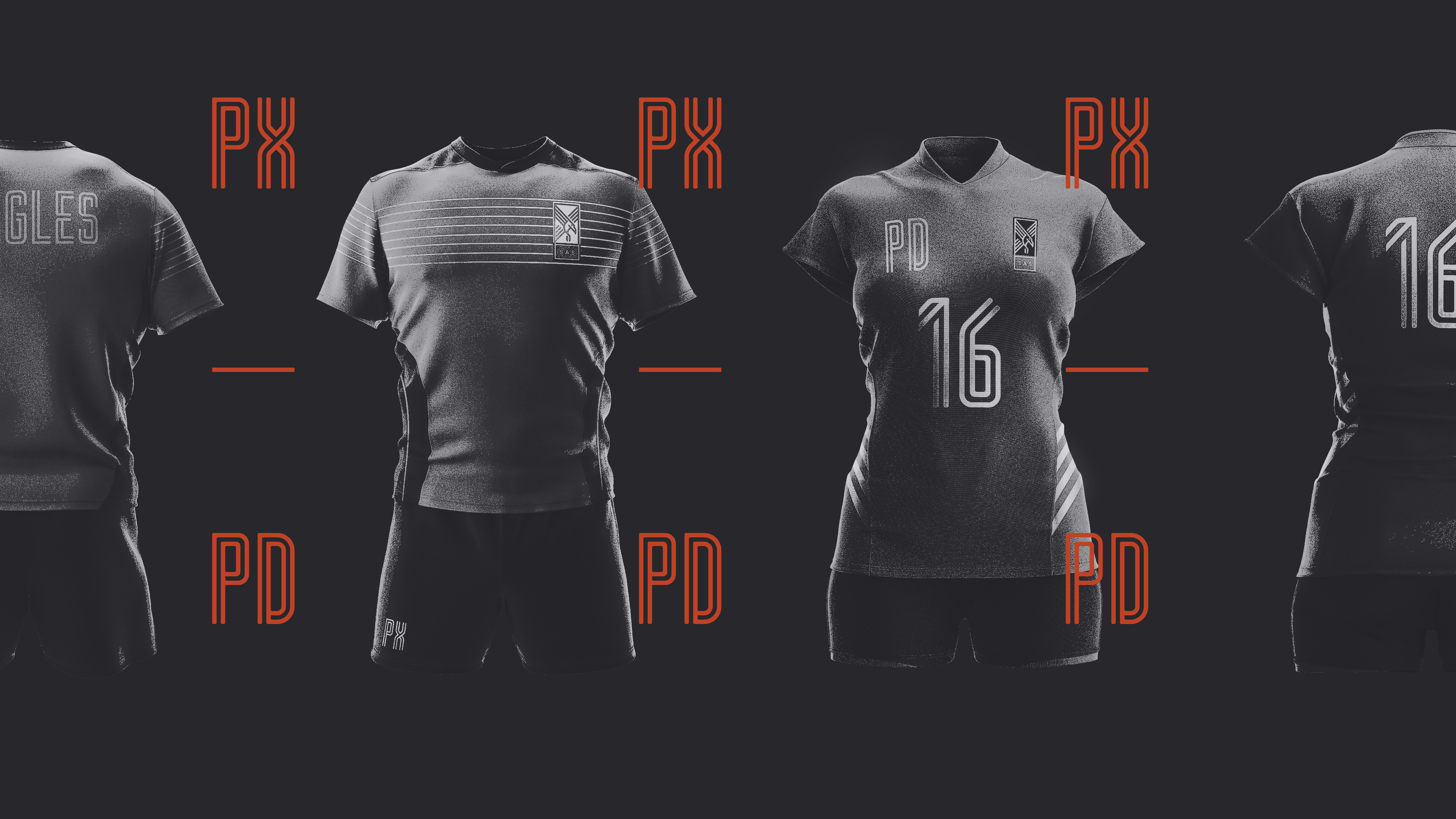
You don’t get to be the oldest and largest international school in China without a few stories along the way. Over the course of its 100+ year history, the Shanghai American School has withstood revolutions, moved campuses (including a brief stint holding classes in an internment camp shed), born and lost and rediscovered its legends and survived to become the academic and athletic powerhouse that it is today. The question put to us: How might a new visual identity capture such extraordinary history while charting a course for the future? SAS is defined by its dualities—here, East meets West, strong athletics complement rigorous academics, history shapes future. The brand cannot be defined by any one dominant feature, but rather by its rich dichotomies. So we built a robust identity that speaks to legacy, rigor, resilience and courage, giving the school a cohesive visual language that allows each division, department and team to distinguish itself while retaining a unified thread. The system embodies the full spectrum of the SAS voice—sophisticated and inviting on one end, unapologetically proud on the other, imbued with meaning throughout. For instance, the parallel lines constructing the custom display font represent the school’s two campuses, separated by the Huangpu River. The flexible graphic logo celebrates everyday acts of brilliance, bringing diversity and vitality into a consistent, unifying frame.