The Making of Zapfino Arabic
by Ajda Zupančič (Text) and Norman Posselt (Photos)

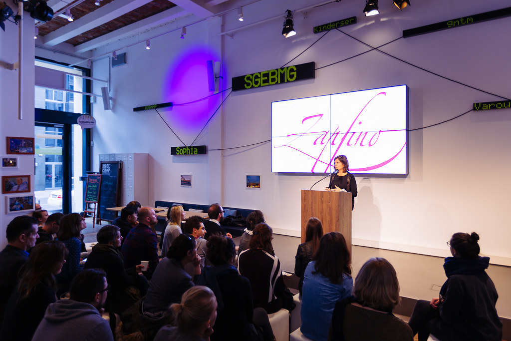
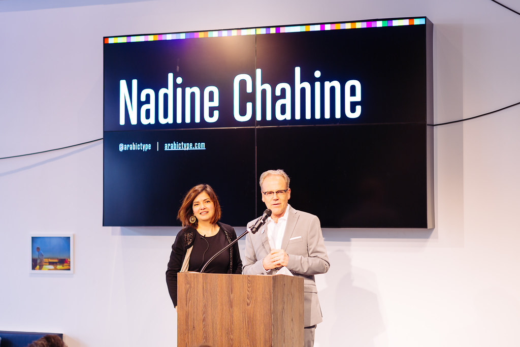
On Friday, April 17 2015, CreativeMornings Berlin presented Nadine Chahine, a Lebanese type designer who works at Monotype as the Arabic type design specialist. Among others she designed arabic versions of Frutiger, Neue Helvetica, and Palatino. She talked about her latest and most challenging project – the Arabic version of the well established Latin script typeface Zapfino.
Chahine has always been interested in the relationship between Arabic and Latin and how they can coexist in harmony. The idea of working on Zapfino Arabic started as a joke amongst her colleagues at Monotype – it seemed way too complicated to be meant seriously. But in 2012 she did a PhD in legibility studies, focusing on Arabic script, for which she designed three typefaces, including Afandem typeface, which is based on manuscript Naskh. It was her first attempt at a calligraphic design and she enjoyed the drawing of it, the elegance, the fact that it is not utilitarian, and the nice movement that comes with it. And after designing something so complex, the idea became really interesting.
In summer 2012 she was almost finished with her PhD, and — as she described it — slightly masochistically, she decided to start working on Zapfino. Chahine drew a few characters, printed them out and went to visit professor Hermann Zapf. He liked the idea, and for the next two years she would be visiting him. Nadine Chahine would draw characters directly on the computer and Zapf would give her feedback. They would always have pear cake his wife had prepared.
 Chahine’s approach to designing an Arabic version of a Latin type is very pragmatic: She always starts with looking at the intended function of the original typeface and the function of the Arabic has to stay the same. It’s impossible to just copy the Latin style and implement it. Zapfino is based on professor Zapf’s handwriting, so it had to look like he would be writing in Arabic.
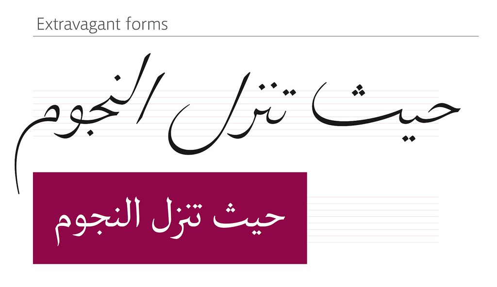
The first challenge was which way to tilt. Latin is written from left to right and Zapfino is slanted forward. But Arabic is written in the opposite direction, so here is the first problem. If Arabic was tilted forward they would clash together. If you tilt them in the same direction one is forward and one is backwards and the logic doesn’t work. There is a calligraphic style in Arabic where the writing is backslanted, but it didn’t fit the other criteria, so it had to be a hybrid. Chahine wasn’t just designing a calligraphic typeface, she was inventing a calligraphic style.
Another issue were the proportions of the ascenders and descenders — they had to be a little exaggerated to give it the “Zapfino flair”. How big could she make them to still be acceptable? At the end of the day it shouldn’t look like a joke, it should just look like someone was really excited.
With thicks and thins it had to follow the Zapfino, but not 100%. “There are thins that we can accept in latin but not in Arabic”, Chahine explains. One of the most difficult aspects of the design was to draw the characters separately and make them look like it was one stroke. In Arabic there are many different context sensitive forms, different versions of every character because of the connecting logic with the one that comes before and after. There are around 20 to 30 possibilities for each character and they all just have to work. In the end it resulted in around 600–700 characters. “It’s not a lot, when I scroll down, it finishes quickly”, she says.
Her design tool was Glyphs, because it enabled her to design in string. The changing connecting logic made it impossible to design only in individual letters, so she had to design in words. “The open type features are very complex, kerning is a nightmare but with this tool it was manageable.”
The project was one of the most difficult she had worked on so far. Maybe that’s why she respectfully calls it her Mount Everest. “The unofficial name of Zapfino Arabic is ‘Designed With Love’, this is how difficult it was. The only easy thing about the project was the name, everything else was just suicidal“, Chahine sums up.
Interestingly enough, she finds designing Latin harder and more frustrating: “It’s like you guys are sitting so close to each other and you’re trying to find a space to sit in the middle. There are so many typefaces that exist and there is nothing you can draw that wouldn’t look like something else.”
At the end of her talk at Creative Mornings Nadine Chahine added that respect for the other should be the basis for anything, and not just in type: “Specifically with Latin and Arabic we need to respect the other and understand that they’re different and that it’s OK to be different. And then you can try to make them work together, live together. And I’m speaking culturally, politically and design wise — it’s all the same.”
 This blog entry was written by Ajda Zupančič (middle) from EdenSpiekermann; Ajda is also member of the TYPO Berlin Editorial Team 2015